
The Glassy Dream That Never Left Us
“How a forgotten design era from the early internet quietly shaped the mood behind our Element collection.”
Most Millennials, Gen Z, and younger Gen X remember an era where technology and nature had '“meshed”. The mecha world and the organic world were living copacetically in a new age world that was the early to mid 2000’s. Futurism had taken hold and an optimistic promise of a brighter, technologically advanced future had taken hold.
If you spent any time on the internet between 2003 and 2013, you encountered this light optimism, rendered in pixels, on screensavers and desktop wallpapers and software splash screens. It now has a name, though most people don’t know it. It’s called Frutiger Aero.
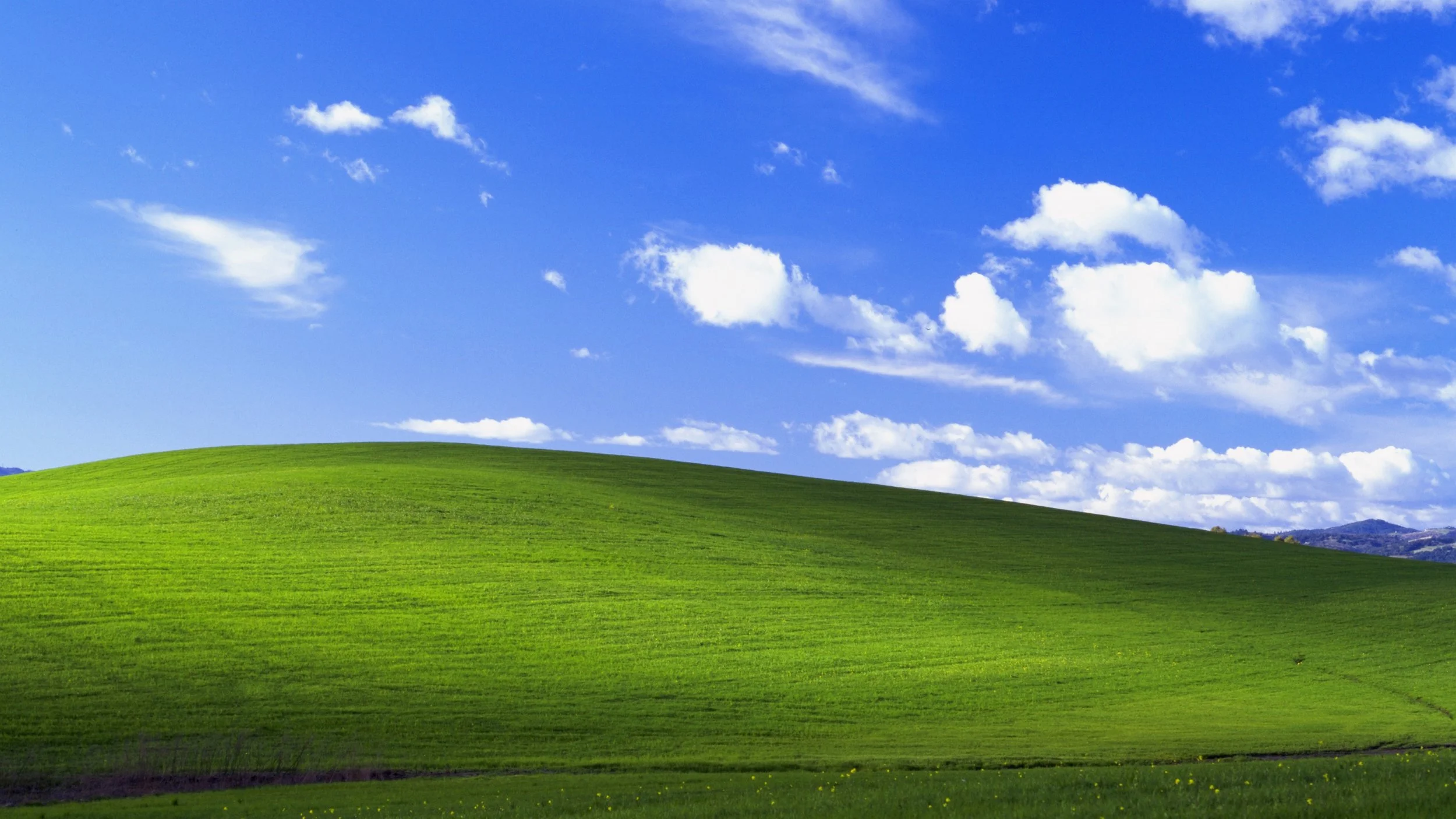
Bliss Hills - Windows XP Wallpaper
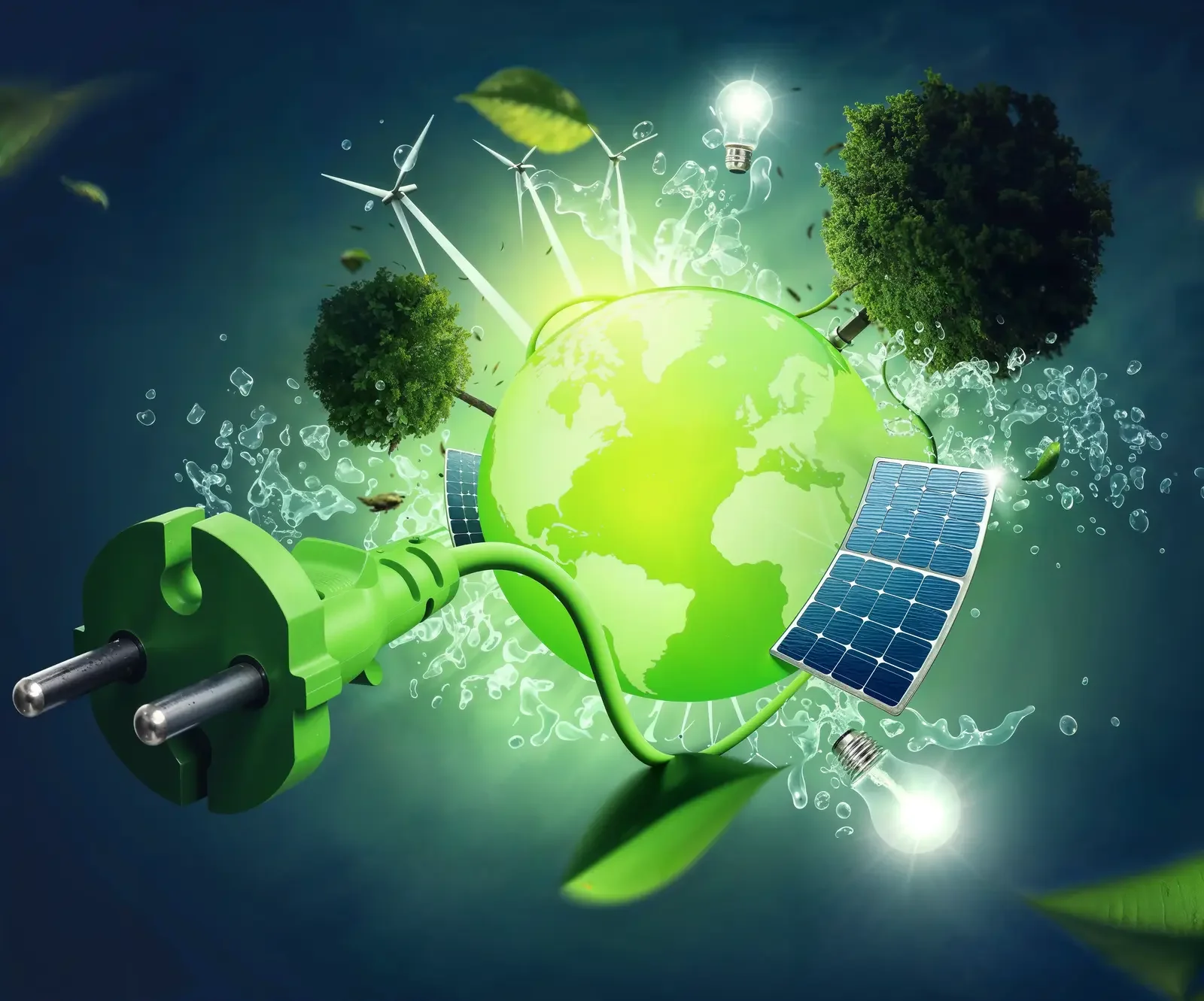
The term was coined retroactively. A portmanteau honoring Adrian Frutiger, the Swiss typographer, and the Windows Aero interface language that Microsoft introduced with Vista in 2006. But the aesthetic was never really about software. It was a feeling: the sense that technology, nature, and something vaguely utopian were about to converge. Glassy surfaces. Bubbles suspended in luminous space. Photorealistic dewdrops on a leaf. The Windows XP hillside, so saturated it looked like an idea of nature rather than a photograph of it.


“It was the promise that screens could be beautiful. That digital life could feel as clean and alive as a still morning.”
Frutiger Aero was optimistic in a way that feels almost naïve now, which is precisely why it has returned. Nostalgia always seeks out the sincerity it left behind. In the early 2020s, designers and artists began revisiting the aesthetic, not ironically, as they had with Y2K chrome and gradient maximalism, but with genuine tenderness. Something in that translucent, living-world imagery spoke to a cultural longing: for clarity, for presence, for environments that breathe.

Asadal Design, Microsoft, Apple
Where an aesthetic becomes a material language.
We came to Frutiger Aero the way most creative obsessions begin: sideways, through something else. In the early stages of developing the Element collection, we were sketching fragrance territories around the idea of liminal states. The moment between water and air, between winter and spring, between the interior of a forest and its edge. We kept returning to the same reference images. Glass orbs. Submerged light. Leaves filmed with moisture. Green depth with a lit quality at its center.
It took a while to recognize that these were not arbitrary image searches. They were the visual grammar of Frutiger Aero, surfacing from our collective memory. The aesthetic had embedded itself in us during formative years of screen-use, and now it was offering a lens for something sensory and physical.
The colors told us everything. That particular blue-green (neither sea nor sky, but somehow both) became the palette for the Frutiger collection. Not decorative color, but structural color: the kind that carries emotional information before you have consciously processed it. Cool, light-filled, alive.


Translucency is the intent.
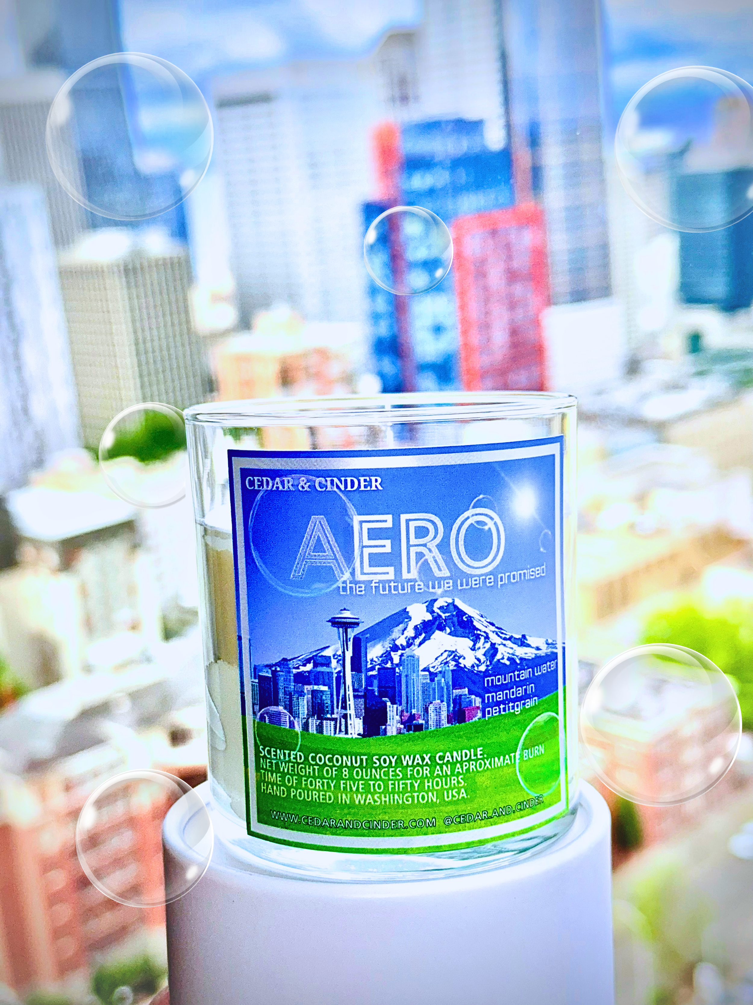
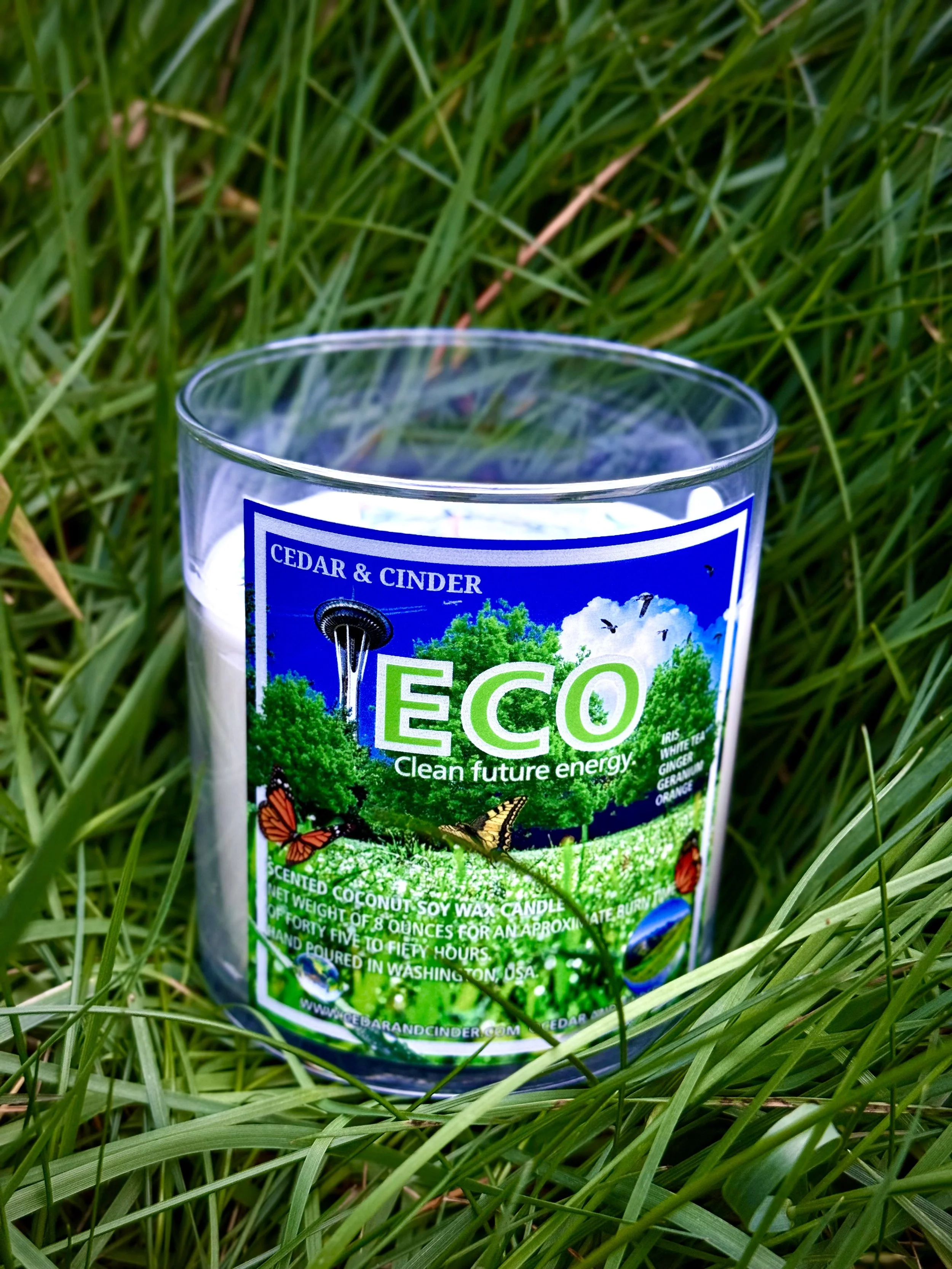
Frutiger Aero's most defining quality was not its color or its imagery, but its relationship to light. Everything in the aesthetic seemed to hold light rather than reflect it. Glass, water, leaves, bubbles. All surfaces that allow something through while still giving back a version of what they receive. We thought a lot about that quality when we were working on the vessels for Element. The clear glass we eventually chose for the containers came directly from this thinking. It showcases the flame, creates a glow directly from the light source, and makes the object feel inhabited rather than merely lit.
The same logic shaped our approach to the fragrance itself. Each candle in Element carries top notes that open with what we can only describe as aqueous clarity. An almost transparent quality, like a note held in a clean room. The complexity comes in underneath, grounded in woods and resins, but the entry point is always that moment of translucency. You encounter something clear before encountering something deep. It mirrors the way the aesthetic works: the glossy surface first, then the dimensional space within.
There is also something worth saying about the relationship between Frutiger Aero and nature. The aesthetic was famously obsessed with biological imagery. Leaves, water droplets, grass, light through foliage. Rendered with a hyper-real vividness that made them feel more like ideals than records. The XP wallpaper was too green. The dewdrops too perfect. But this idealization was not meant to be cynical. If anything, it was aspirational. The technology was reaching toward the natural world as if hoping the two might eventually meet. That tension between the digital and the organic, between something made and something grown. It is exactly the territory Cedar & Cinder has always wanted to occupy. We make objects. But we make them about living environments, experiences, and memory.


Why this moment, why now?
There is a generational quality to why Frutiger Aero resonates so strongly right now. Those who grew up in the early 2000s are now in their late twenties to early forties, at the age when formative aesthetics begin to loop back as comfort and as resource. The look carries a particular quality of recalled optimism. A pre-social-media internet, when digital space still felt spacious and possibility-forward, before algorithmic surfaces hardened into the flat, high-contrast design language of the late 2010s.
But there is something deeper than nostalgia at work too. Flat design (the successor that replaced Frutiger Aero) was efficient and legible and, in its way, elegant. But it was resolutely unambiguous. Everything was surface. Frutiger Aero, by contrast, always implied depth. There was always something behind the glass, inside the bubble, beneath the water. In an era saturated with information and depleted of mystery, there is an appetite for that implied interior space again.


The Element collection does not reproduce Frutiger Aero. It simply, would be strange to translate a screen aesthetic directly into a physical object and expect the result to feel genuine. What it draws from is the emotional logic underneath the idea that clarity and depth can coexist, that things can be luminous without being harsh, that natural forms rendered with care and precision carry a kind of optimism that its more austere aesthetics cannot. We wanted candles that feel like early morning through glass. Like looking at something through very clean water. Like the kind of screen glow that used to feel, briefly and inexplicably, like a window.
That is what Frutiger Aero gave us, in the end. It is an experience that resurfaces nostalgia, and allows us to relive the optimism we once had. We hope you find that optimism in the flame.